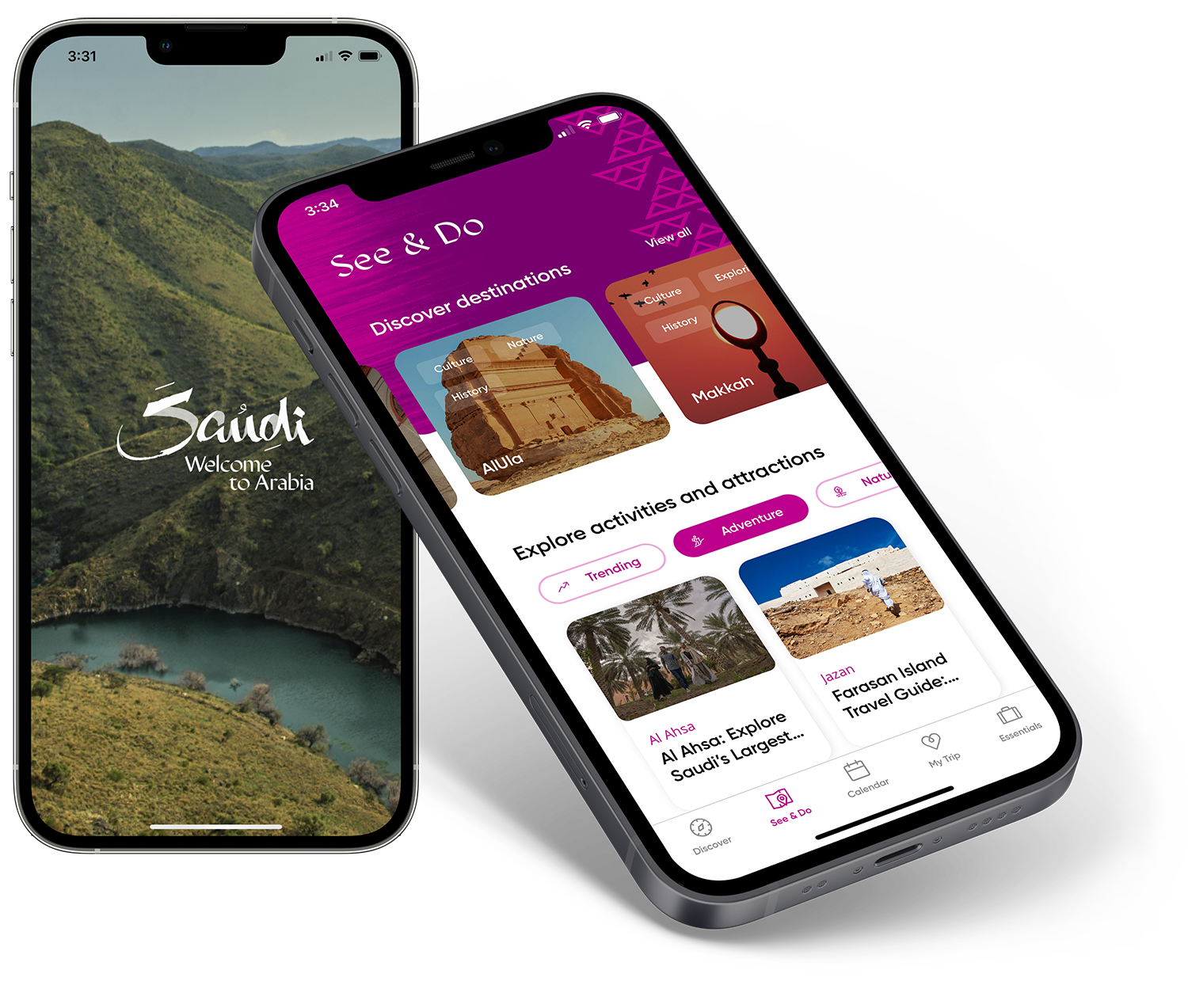
Redesign of a digital-first Banking platform for enhanced customer engagement and conversion
Digital-first Banking Platform
Redesign of the banking platform for a major Indian Banking & Finance company. Created a design system to ensure compliance with usability standards and practices, and established design standards for future design and development.
Overview
The client, a large digital-first bank, was looking to launch new products and had engaged an external vendor for a design update and visual refresh of their digital assets (website and app). However, the delivered designs were receiving low satisfaction scores in Closed User Group (CUG) testing and my team was called in to determine the cause and propose solutions. The most affected metrics included low task completion rates on key user journeys, high variance in task completion times, a low error-free rate with a high number of non-critical errors and comparatively fewer but an unacceptable number of critical errors.
The launch of the redesigned platform had been delayed twice by this point and the client stakeholders were under tremendous internal pressure to launch in the next two weeks, despite these problems. This gave us two days to analyze and determine the problem and propose a solution roadmap, and get buy-in from key stakeholders for a launch extension.
My Role
UX Design
Design Research
Design Strategy
Project Management
Prototyping
User Testing
Team
Principal Designer - me
UX Designers
Business strategy team
Client teams - business, marketing, technology
Design vendor team
Development partner team
Key Activities
Heuristic Design to identify pain points and opportunities
Design strategy for quick turnaround of the redesigned UX
Project management & coordination with all stakeholder teams
IA, UX, UI design and usability testing
Research
With only 2 days in hand, there wasn’t enough time to conduct a thorough heuristic analysis (a type of design review) of the digital assets. We conducted a half-day dipstick design audit and found a number of usability issues that revealed a capability gap at the design phase. We also found inconsistencies in UX design patterns and UI design that added to user confusion.
Our design research findings and recommendations helped client stakeholders commit 2 additional months of design and development time to correct errors and deliver improved UX before launch.
NOTE: After getting client approval for a timeline extension, we augmented the dipstick heuristic analyses with detailed design research with 36 respondents covering all key user journeys.
Approach
Design Control Tower
A Design Control Tower was established to coordinate the multiple workstreams and provide project status visibility to all stakeholders. This transparency facilitated quick and coordinated redesign and development of the key user journeys, and provided a window into the process for the client leadership team.

Heuristic Analysis
Multiple inconsistencies were identified in the design, ranging from incorrect or outdated design patterns, web forms that didn’t follow updated design standards and differed from one user journey to the next, inconsistencies across desktop web, mobile web and app experiences, among others.
The visual language lacked refinement and cohesion - across typography, UX copywriting, photography and illustration styles, icon design and interaction design.
Immersion Sessions
Multiple immersion sessions were conducted with client and partner stakeholders as well as the various project teams through the project. This helped to align findings and approaches, and to sync the efforts of design and tech teams towards timely turnarounds.
Activity Snippets
Design Audit
Heuristic analysis of the platform revealed numerous inconsistencies in the design system, which contributed to confusion and fragmentation of the Customer Experience.
Mapping the Landscape of Vendors and Design Systems
We mapped and compiled the various brand and UX manuals and guidelines from previous vendors to understand the scope of changes required.
This slide shows the 9 different design and development vendors that had been engaged on the project thus far, each with their own design approaches - leading to a fragmented end-user experience.
Brand Redesign
Advocated for a redesigned, consistent and distinct Brand language - to add character and voice to the brand experience.
Design of Key Journeys
Multiple key user journeys were redesigned across responsive web and app. This fixed the most critical user journeys in time for the launch of the redesigned platform, following which a larger redesign effort implemented the new design system and approach across the rest of the platform.
The Key user journeys that were prioritized for redesign included:
Homepage
Savings & Deposits
Personal Loans
Payments
Credit Cards


Outcomes
The Design Control Tower approach helped create internal and external stakeholder alignment, and formed a confluence of multiple workstreams, helping launch the redesign within a tight timeframe.

The client banking site and app were successfully launched in early 2021 with key user journeys redesigned, leading to monthly improvement in customer satisfaction and engagement scores.

Following the launch, the client team updated the rest of the platform by implementing the new design system and usability guidelines.